Brand Guidelines
Logos, colors, typography, mascot, and voice for OffOn.
Mission and Values
A welcoming open source community to learn through hands-on challenges, share knowledge, and build together.
Vendor-Neutral
We only discuss and recommend open source tools. Proprietary or vendor-specific technology is out of scope.
Open Source
The challenges, tools, and content are open source. Anyone can participate, contribute, and build on what's here.
Community-Driven
Direction and content come from contributors. There is no central authority deciding what matters.
Logo
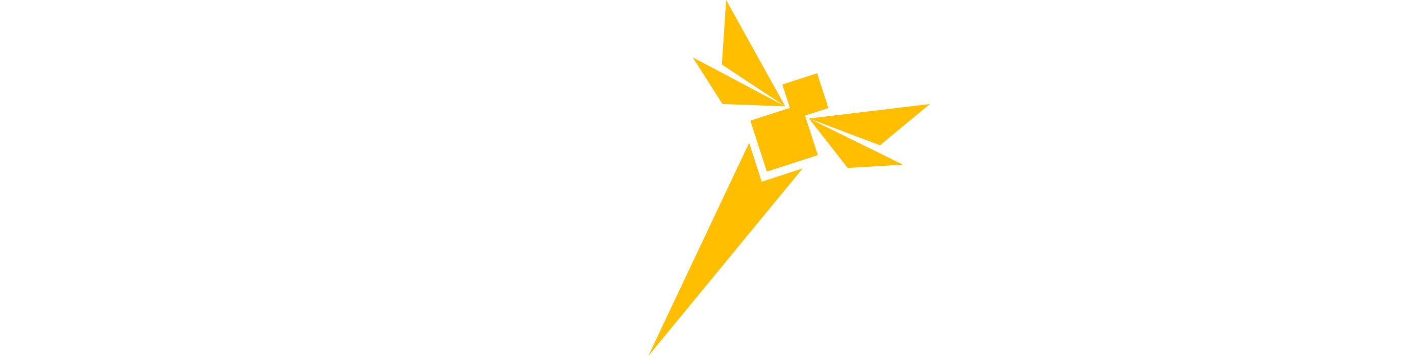
Project Mark
The horizontal wordmark is the preferred form. Use the icon mark alone only when the wordmark won't fit (minimum 24 px icon height).
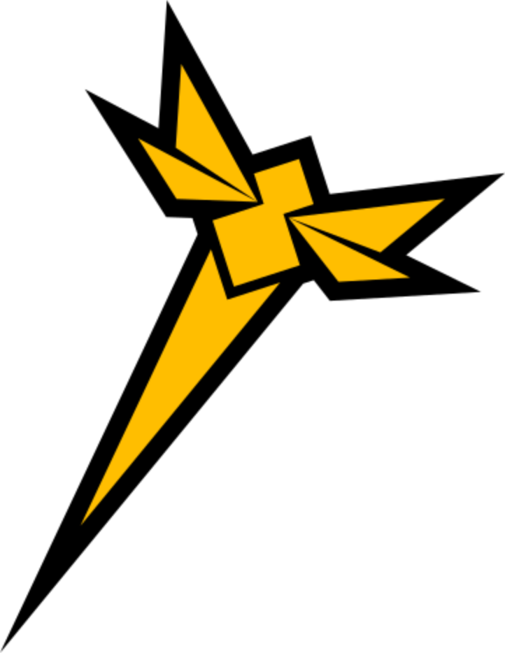
Icon Mark
A geometric amber firefly bolt. Use it at 24 px minimum. Never rotate, recolor, or distort it.

Do and Don't
Do
- Use the correct variant for the background color
- Maintain clear space equal to the "O" height on all sides
- Scale proportionally
- Use the icon mark when the wordmark won't fit
- Use mono variants for print or embroidery
Don't
- Don't recolor, outline, or add drop shadows
- Don't use the dark logo on light backgrounds
- Don't stretch, skew, or rotate
- Don't place the logo over busy images or patterns
- Don't use the color logo where mono is required
Colors
All colors are CSS custom properties in src/index.css. Reference tokens, not hardcoded hex values.
Amber Primary
41 100% 60%
Fills, borders, focus rings, accent highlights. ~12:1 on dark bg.
Background
0 0% 4%
Page background.
Card
240 9% 9%
Card and section surfaces.
Foreground
47 54% 98%
Primary text. ~19:1 on dark bg.
Border
219 36% 18%
Borders and dividers.
Link hover
41 100% 60%
Link hover and active state on dark backgrounds. ~12:1 on dark bg.
Amber Primary
41 100% 60%
Fills and borders only. Never as text color.
Background
220 12% 98%
Page background.
Card
220 10% 96%
Card and section surfaces.
Foreground
240 25% 8%
Primary text. ~18:1 on light bg.
Border
220 12% 87%
Borders and dividers.
Link hover
41 100% 22%
Amber inline link hover. ~7.4:1 on light bg.
Amber in light mode: fill and border only. For hover text use --link-hover-light.
Typography
All fonts are self-hosted as WOFF2. No external requests. Use the font-heading, font-sans, and font-mono Tailwind utilities.
Syne
font-heading / 700 / Headings and displayInter
font-sans / 400-600 / Body and UIOpen source community for everyone.
Learn through hands-on challenges.
Build together. Grow together.
JetBrains Mono
font-mono / 400-600 / Code and tokens--primary: 41 100% 60%;
--font-heading: Syne, 'Syne Fallback', sans-serif;
--background: 0 0% 4%;
hsl(var(--foreground))Design Elements
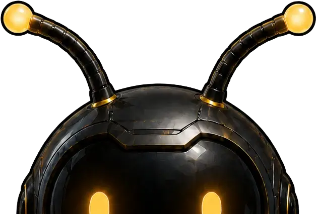
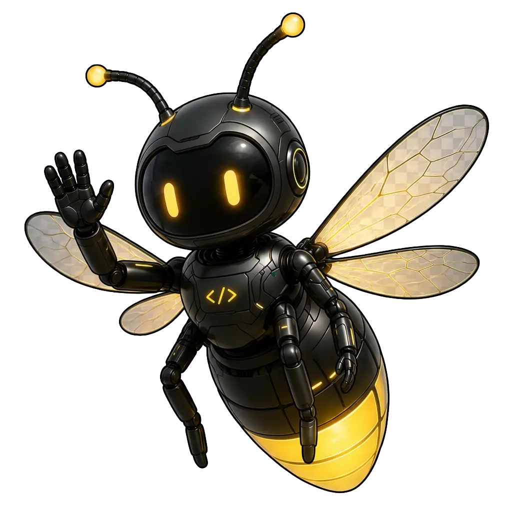
Mascot: Nyx
Nyx is the OffOn firefly mascot. Nyx is gender neutral, so avoid gendered pronouns. Use Nyx in event materials, swag, and community campaigns. Don't alter the colors, proportions, or shape.

Open Graph Image
Used as the social media preview when OffOn links are shared. Dimensions: 1200 x 630 px.
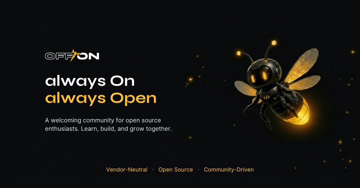
og.png · 1200 × 630
Photography
When photography appears in OffOn materials, it should feel raw and technical, not polished stock imagery.
Use
- Real developers at real terminals
- Dark environments that echo the dark mode palette
- Collaborative scenes with multiple contributors
- Warm amber or neutral accent lighting
- Diverse representation of the open source community
- Legible code on screens where visible
Avoid
- Stock photos of people smiling at laptops
- Bright, corporate-feeling environments
- Heavily retouched or filtered images
- Low-quality clipart or filler illustrations
- Photos with visible vendor brand logos
- Images that imply exclusion
When photos aren't available
Use the Nyx mascot or abstract dark/amber compositions. A clean empty section is better than a distracting stock photo.
Voice and Tone
Brand Name
Always camelCase. Domain is always lowercase: offon.dev
Slogans
Primary
Vendor-Neutral. Open Source. Community-Driven.
Secondary
always On. always Open. always Learning.
The lowercase "always" is intentional.
Tone
We are
- Direct and to the point
- Focused on the community, not the brand
- Inclusive and welcoming
- Plain-spoken, no unnecessary jargon
- Active voice wherever possible
We are not
- Corporate or formal
- Hype-driven or hollow
- Exclusive or gatekeeping
- Vendor-aligned in language
- Passive or hedging
Accessibility
Every page on OffOn targets WCAG 2.2 Level AA for structure and interaction. Body text contrast targets AAA (7:1) in both light and dark mode. The full statement, testing approach, and how to report a barrier are in the Accessibility Statement.
Color and contrast
- Body text: minimum 7:1 contrast (WCAG AAA) in both modes
- Large text (18pt+ or bold 14pt+): minimum 4.5:1 (WCAG AAA)
- UI controls and focus indicators: minimum 3:1
- Never use amber
#ffc034as text in light mode - Hover states must meet contrast in both light and dark
- Never convey meaning through color alone
Interaction and motion
- Every interactive element is keyboard reachable
- Focus rings visible in both modes on all elements
- Touch targets minimum 24 x 24 px (prefer 44 x 44 px)
- Animations respect
prefers-reduced-motion - All images have descriptive alt text